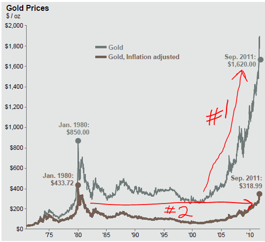
I annotated the chart below to highlight two ways people could look at gold. Arrow #1 shows the nominal (not adjusted for inflation) price of gold. It looks like it’s approaching a bloody vertical asymptote. Arrow #2 shows the real price of gold (real = adjusted for inflation). If you look at the run up in real prices in 1980 (when people were lining up to buy gold), it looks similar to the real price run up now. However, it’s been 31 years and the people who lined up to buy gold in 1980 are still underwater. Well, that’s assuming they held it for 31 years. It was probably closer to 31 months (or weeks). Just sayin’…
Courtesy J.P. Morgan Asset Management
Source: (Left chart) EcoWin, BLS, U.S. Department of Energy, FactSet, J.P. Morgan Asset Management. (Right table) U.S. Geological Survey, WorldGold Council, J.P. Morgan Asset Management. CPI adjusted gold values are calculated using month averages of gold spot prices divided by the CPIvalue for that month. CPI is rebased to 100 at the start of the chart.Data reflect most recently available as of 9/30/11.

The old expression “fool’s gold” certainly comes to mind…
Congratulations, you’re the only hit on Google for “bloody vertical asymptote”.
Nice!
Is your take on silver similar?
Steve
Similar in that it is a solid material that that doesn’t turn raw materials into goods or services in and of itself. It just sits there and we collectively can’t figure out what it’s worth from one day to the next.